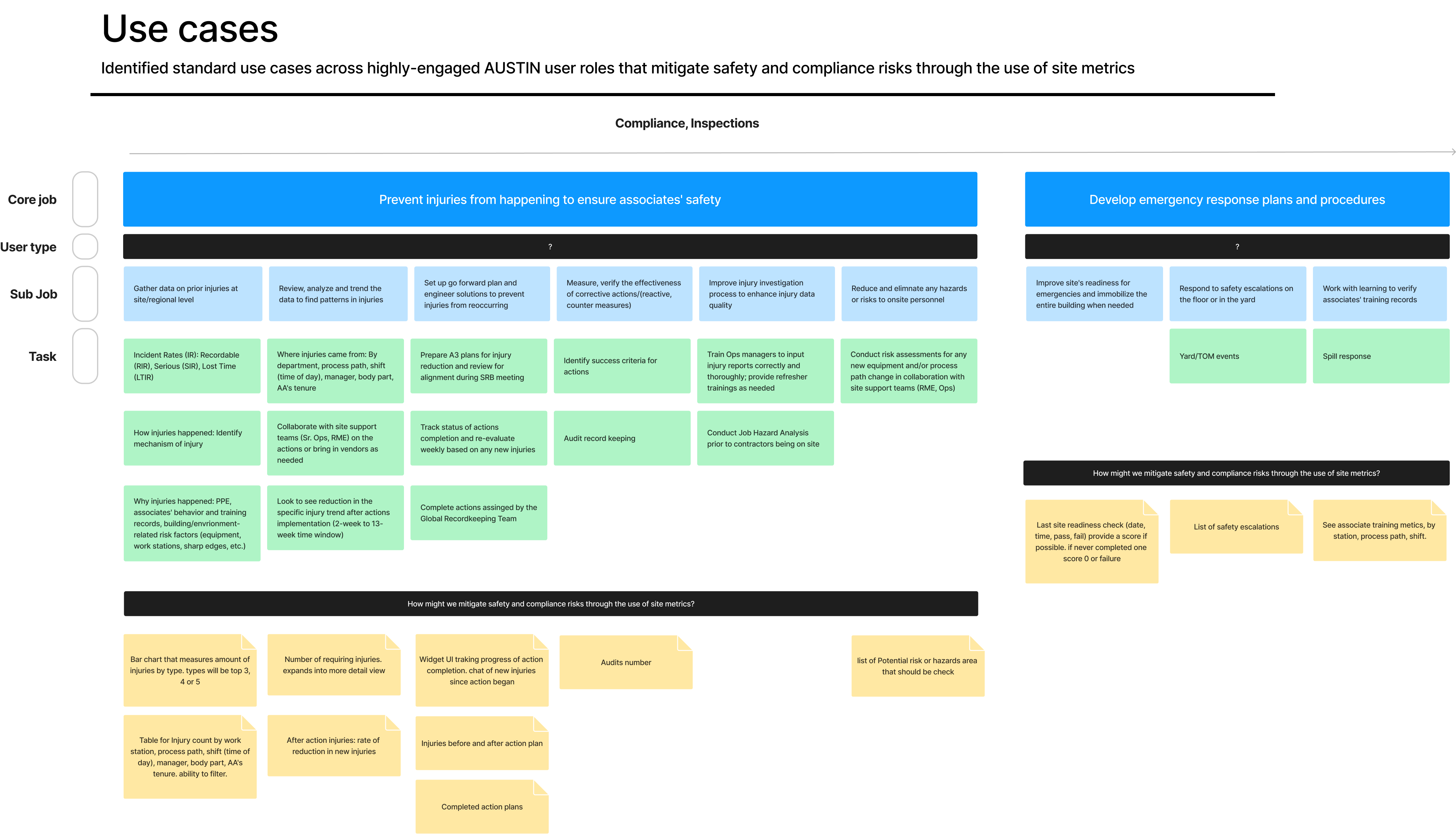
Plan and conduct user research to analyze and develop way to enhance safety protocols and minimize workplace injuries. To ensure UI/UX alignment across AUSTIN platform.
I worked closely with dedicated UX researchers to analyze historical data and patterns, helping Amazon associates predict potential safety risks before they occur. Additionally, I collaborated with safety managers to understand the specific data they need to implement preventive measures. I made recommendations to stakeholders through detailed reports, mockup design solutions, and prototypes.
Create UI that can deliver metrics to users when and where they need it most in order to proactively mitigate safety/compliance risks and task prioritization.
30% of AUSTIN tasks are completed overdue. To manage task, multi-site users must proactively check each site in AUSTIN or 5+ dashboards to identify when work is overdue, and spend 10+ minutes per day to manually navigate through AUSTIN calendar or external dashboards to determine their highest priority work and to avoid missing tasks.
“AUSTIN is missing a good overview. It needs a place where a lot of data is in
1 place” and “…I'd rather clean up roadkill than search for a task or compliance activity in AUSTIN. I
support 90+ sites and it is the worst part of my job.”
-User Test Participant
The test aimed to identify and address user pain points related to safety and compliance at their sites. It evaluated different methods to provide in-app safety insights and features that help users prioritize their Environmental Health and Safety (EHS) workload without needing to search through multiple dashboards. The goal was to establish a framework for all AUSTIN products to offer these in-app safety insights and a task prioritization widgetTop discovery - Users must navigate to different product dashboard and manually use the different filters to identify the status of compliance and work at their site(s)
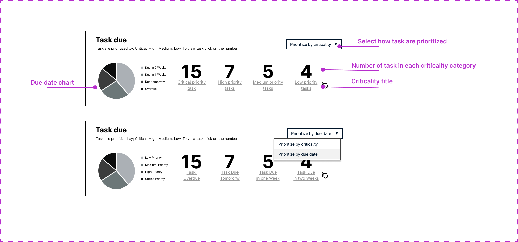
I decided to dive deep into data visualization design principals and ways of presenting data in a way that is intuitive, accessible, and engaging for users. In my research I presented iterations of complex data sets into clear and actionable insights using research backed effective visual representation.
Widget guidelines
Presented a detail report with findings, recommendation and lo-fi mockups with multiple scenarios to stakeholders. The engineering team is due to pick up this project late 2024 However many associates and safety managers are eager to see a system generated prioritized view of potential hazards or incidents, that will enable them to have more immediate responses and to have prioritized reminders for regular safety checks and maintenance tasks that ensure continuous adherence to safety protocols.
Hompepage with task prioritization view
Multiple users expressed frustration with the hassle and time-consuming nature of selecting numerous filters to drill down to specific tasks, then having to reset them to look for different tasks, only to reapply the same filters later. In response to this feedback, I recommended and designed a save filter UI, which allows users to save their filter settings for quick and easy access in the future. The design is illustrated below.
Save/choose fliter flow: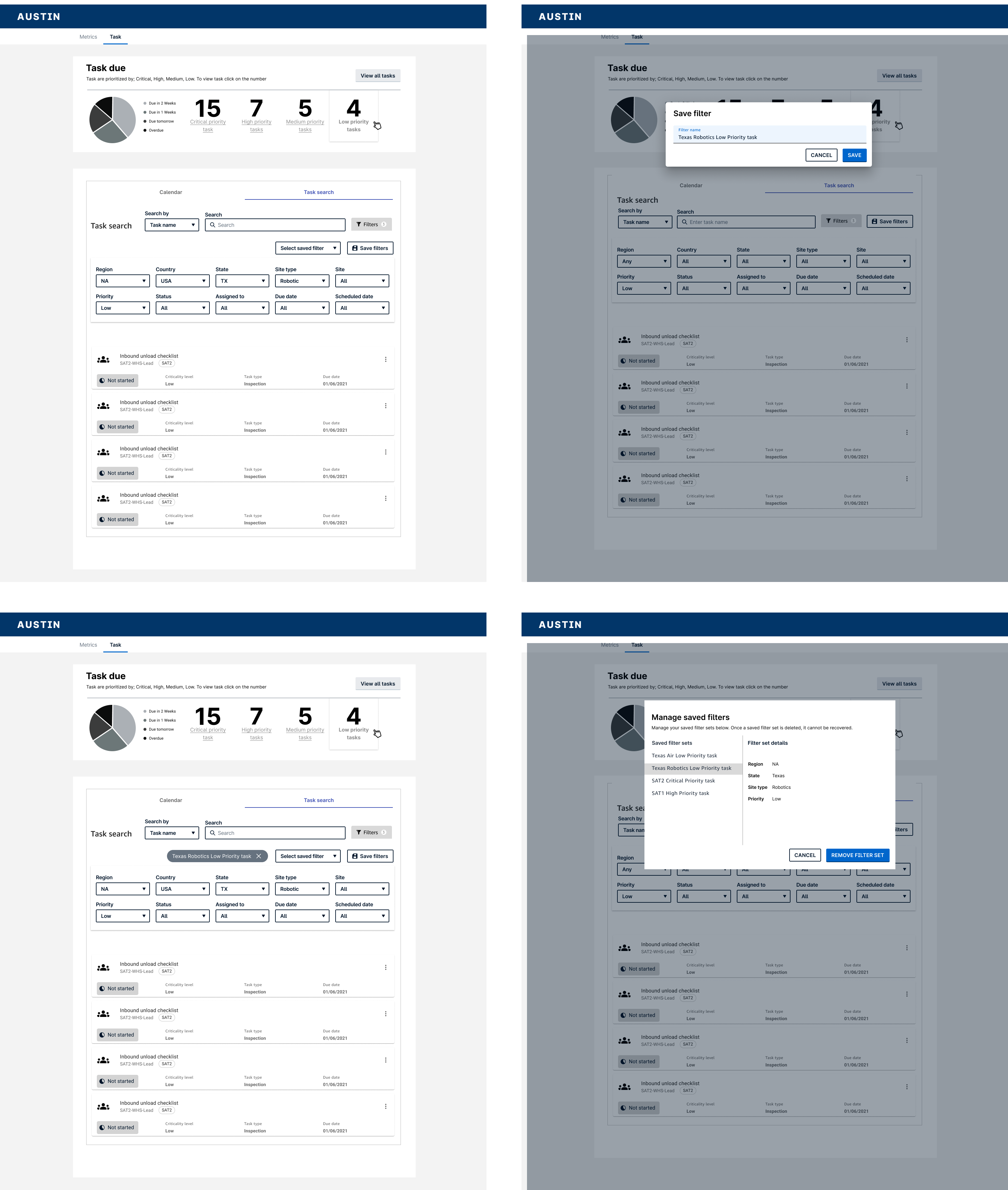
The engineering team is set to begin development of this project later in 2024. My biggest takeaway so far has been discovering the power of storytelling with data. After interviewing numerous users from diverse backgrounds across Amazon, I realized that not everyone is looking for the same story when using their dashboard. There are many complex needs and ways in which data must be displayed to help users effectively mitigate safety risks and remain compliant.
Copyright © Lamonthart.com