Within Amazon’s fulfillment lingo, There is this thing called “Pick info dependencies” these pick info dependancies are responsible for displaying information that is required for the user to know; the location of pick, title of item, description or picture of an item.
The Grocery ReStow application had been conceptualized prior to me joining the project; there were many dependencies already finalized. My role was to figure out a way to display what info was needed for employees to successfully complete the picking & stowing of Amazon Groceries. To gain an understanding of the projects goals and how the UX team can help To synthesize stakeholder documentation and create a list of UX objectives Conduct early user testing with lo-fi wireframes and flow charts Create mockups and prototypes and present to stakeholders
To gain an understanding of the projects goals and how the UX team can help. synthesize stakeholder documentation and create a list of UX objectives
Conduct early user testing with lo-fi wireframes and flow charts
Create mockups and prototypes and present to stakeholders
I started by looking at some rudimentary level workflows of how the product would work from a high level, over time a lot of new ideas branched off in other documents and not comprehensively added into the over all workflow. As I began to redesign the workflow diagrams some initial planned screens i found to be redundant or unnecessary, mainly because of more effective pick info dependencies being added. After aligning workflows and changes with stakeholders, I moved into the next phase of the UX cycle, designing screen flows.
I begin creating screens with a theme consistent with other Amazon directed workflow applications, the challenge here; ReStow requirements differed in a lot of ways from other directed workflow applications. The dependencies where more dynamic than other applications. Examples: by temperatures, by t-stow order, by expiration date, to name a few. However I was still able to design an effective and efficient application flow within limitations of a common look, all while including some innovation, for example: (not part of the original design) a set of screens that captured the number of cases an associate is directed to move and a confirmation to minimize human error. Next I collected feedback from five FC operation specialist. I learned the use of UI elements needed to make sense and align with other directed workflow app experience, in order to make adoption seem like second nature to associates. This was a key take away.
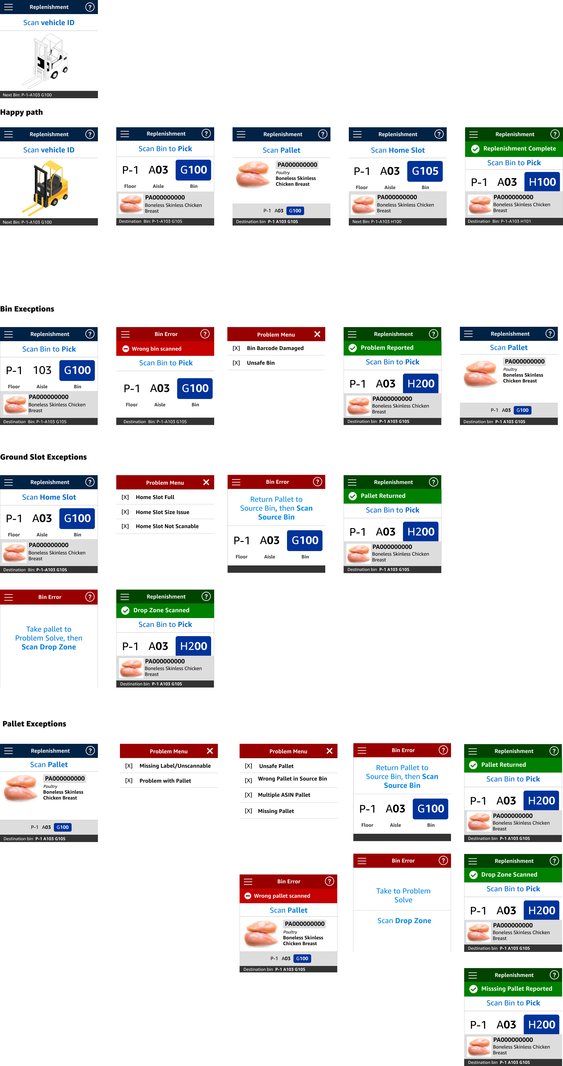
After analyzing TaskUI and incorporating feedback from FC operation managers, I developed and refined a final set of UX screens. I documented the instructions and processes for each screen, aligning them with insights gained from earlier feedback from FC operation specialists. Through multiple review and iteration cycles, I created an interactive prototype demonstrating both the happy path and exception scenarios for Pallet & Case Replenishment.
I presented this prototype to executive-level stakeholders, showcasing its functionality and design. The prototype underwent several rounds of User Acceptance Testing (UAT) and received outstanding results, with minimal issues identified. This accomplishment highlights the importance of user feedback and iterative design
in achieving a successful product. BackCopyright © Lamonthart.com