Project Background
When I joined the MCG project at Amex, my first task was to design the UI for early conceptual ideas and wireframes. I used the Amex design system as a foundation and created additional components and patterns tailored to the app's needs — a decision that proved vital as the product evolved.
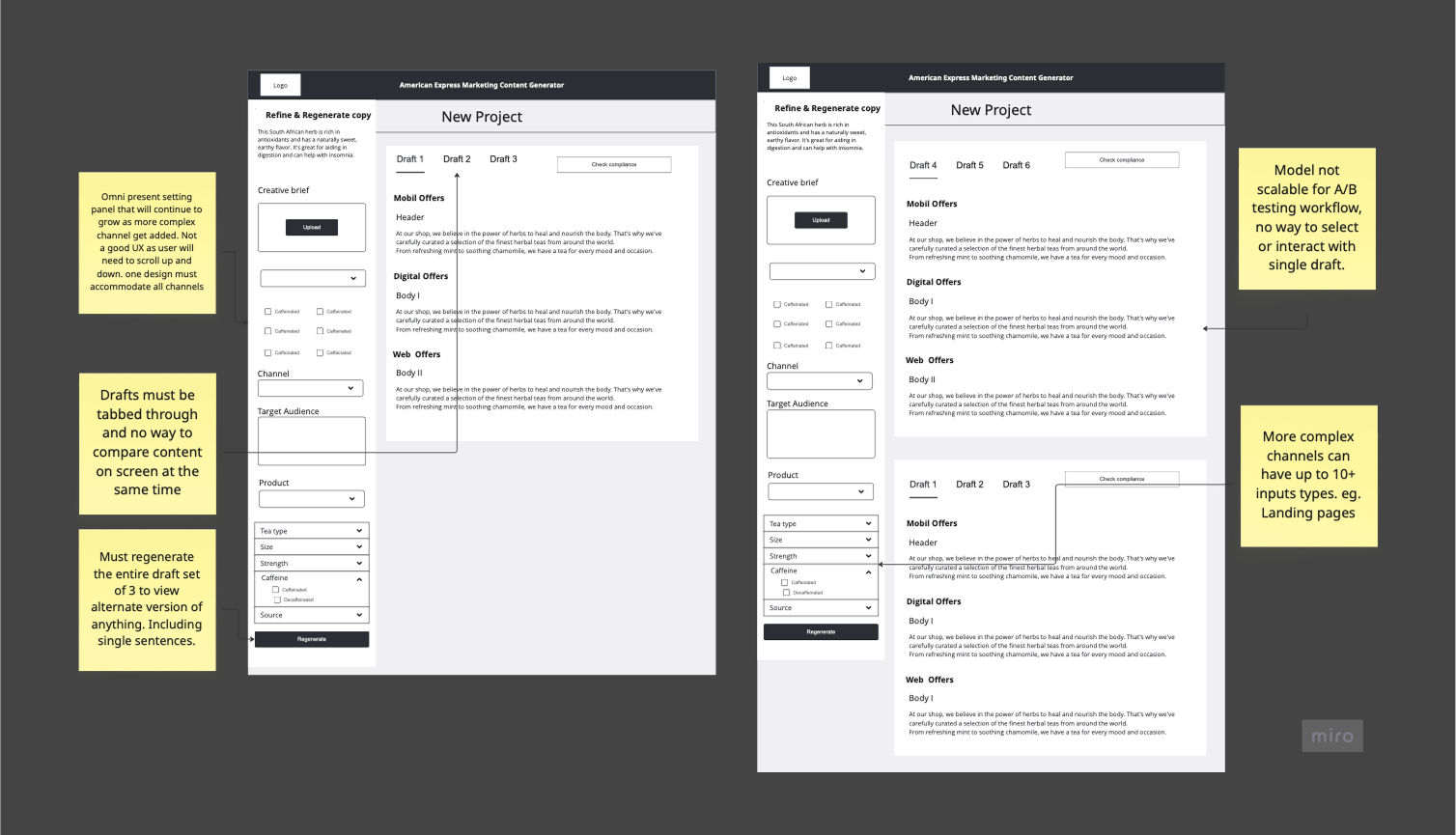
The original concept was overloaded with settings and options. My goal wasn't just to apply a visual layer — it was to reimagine the experience from the ground up.
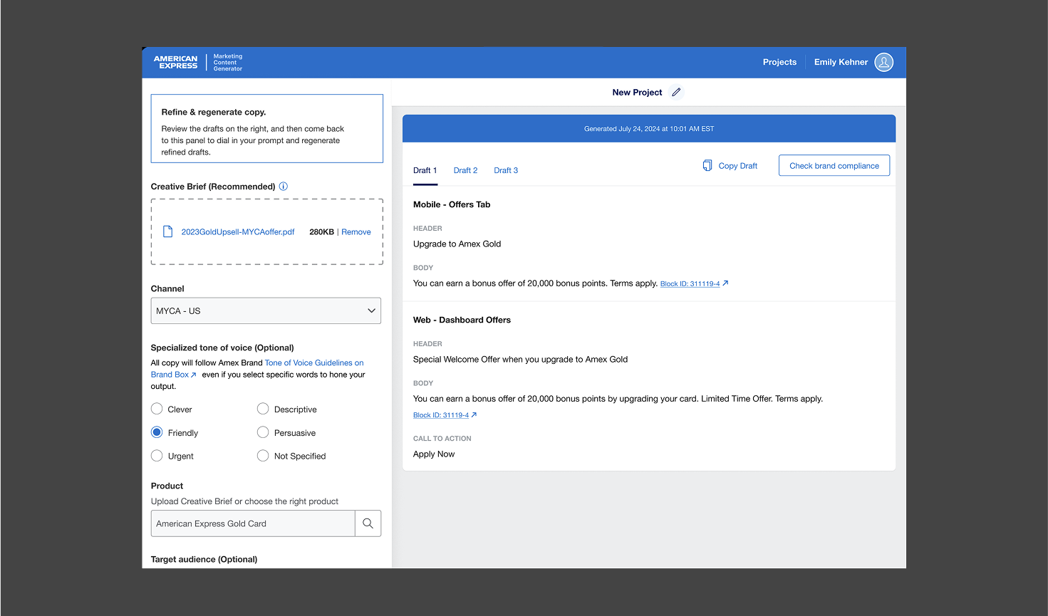
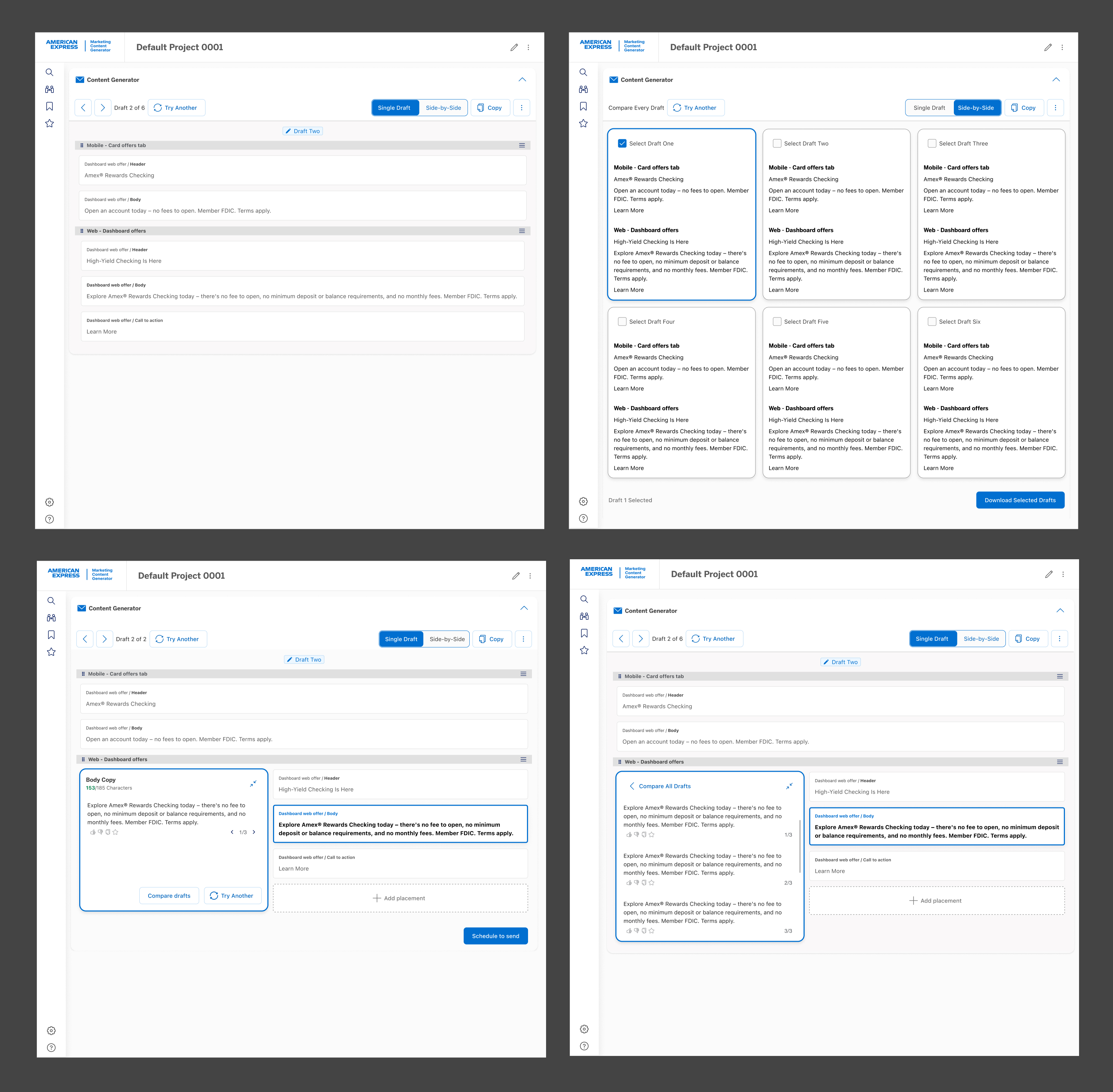
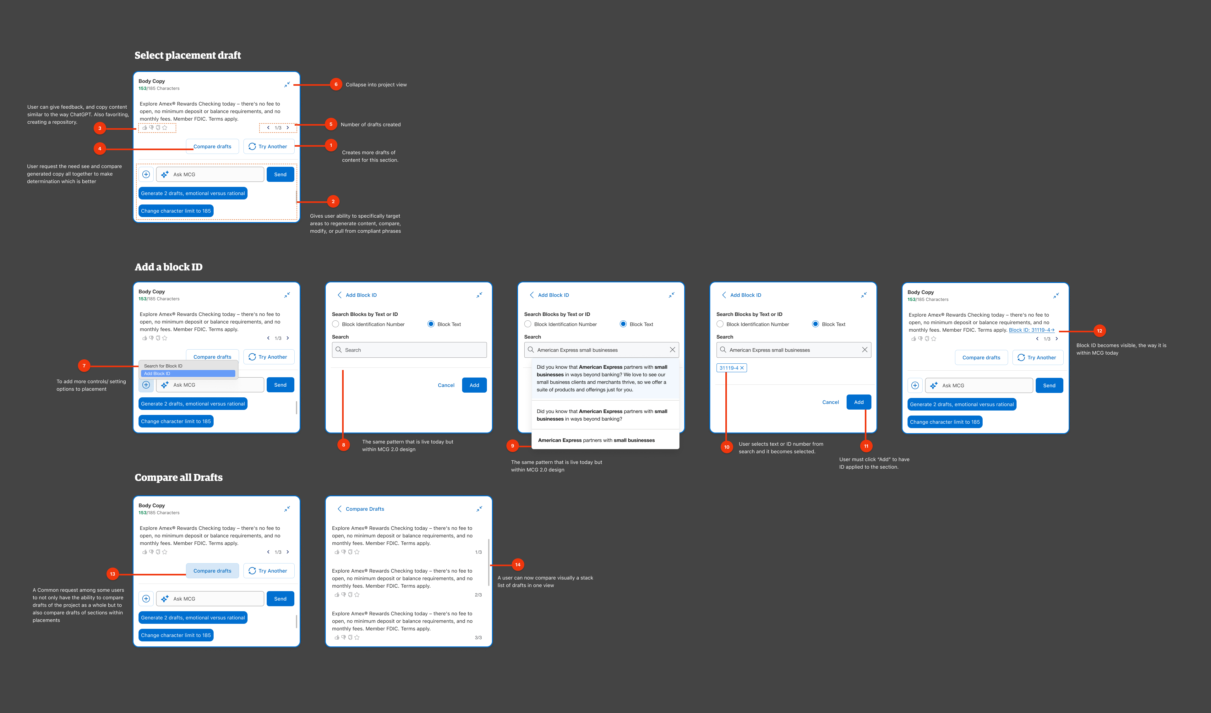
This case study highlights a key evolution in the MCG platform's UX — from a rigid, sidebar-based layout to an intuitive, embedded experience enhanced by Generative AI. While many original visuals are no longer available, the featured screen captures the core design shift: moving from disconnected controls to a context-aware UI that enables faster, clearer, and more confident content creation. This redesign laid the groundwork for multi-channel scalability and AI-powered creative support.
Listening First: What Users Told Us
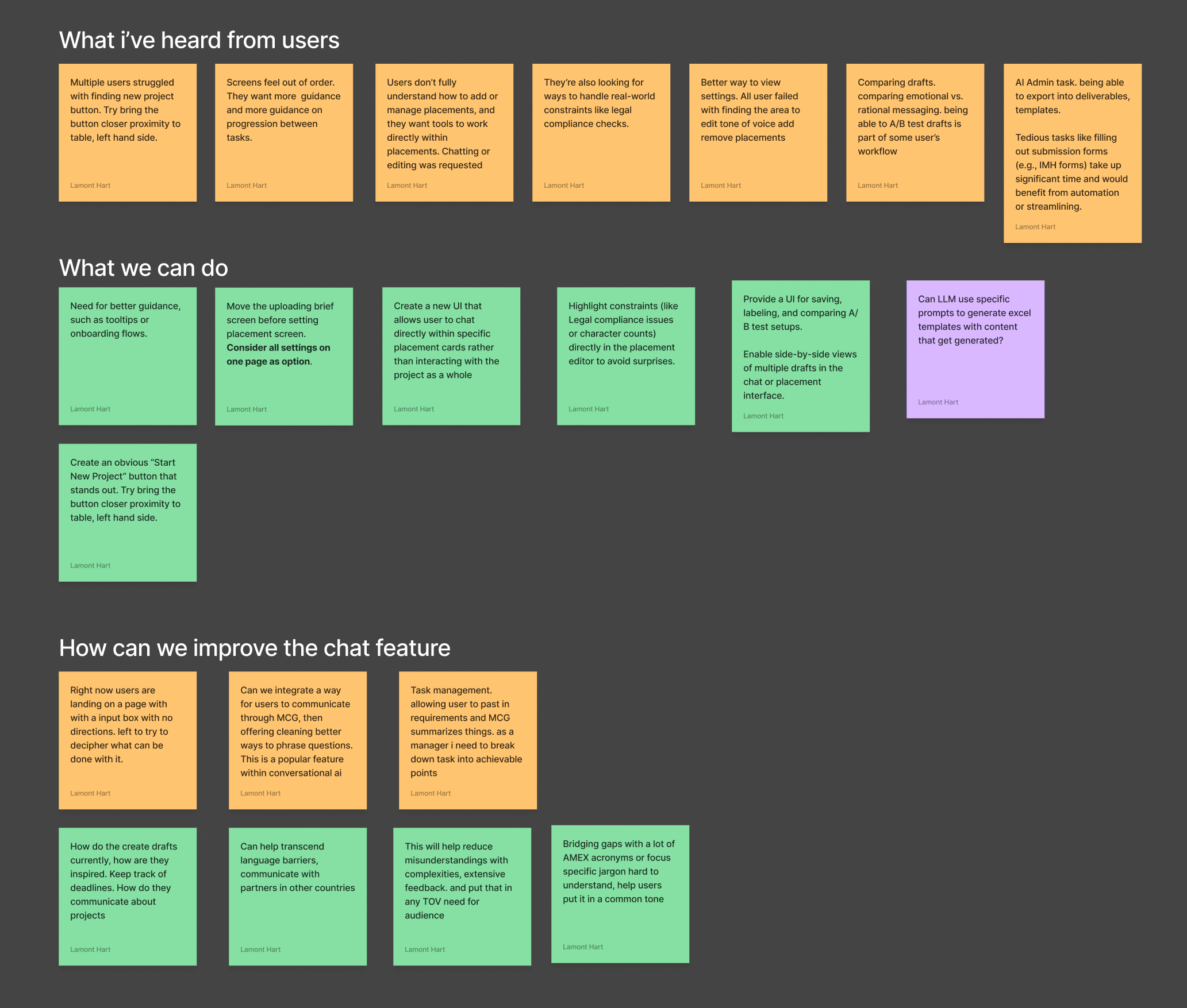
I began by identifying core pain points through stakeholder interviews and early user testing. Feedback revealed critical issues: excessive scrolling, misaligned settings, and a layout that didn't reflect how 60% of users actually worked.
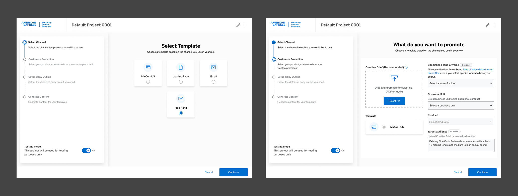
A Modular Setup Experience
As part of the redesign, I reimagined the setup process to better support real user workflows and future product scale. Feedback from user interviews revealed that the original one-page design created confusion, with settings that felt irrelevant or out of order.
To solve this, I introduced a modular, step-by-step setup flow that guides users through key decisions without overwhelming them. Each step is purpose-built, allowing for flexibility based on selected channels while maintaining consistency across the platform.
This new structure not only reduced cognitive load, but also created a scalable framework for future enhancements as the product expands into new marketing channels.
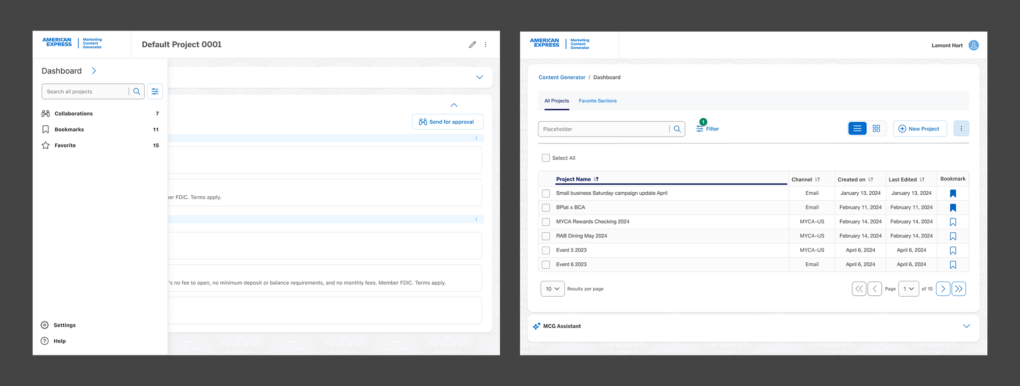
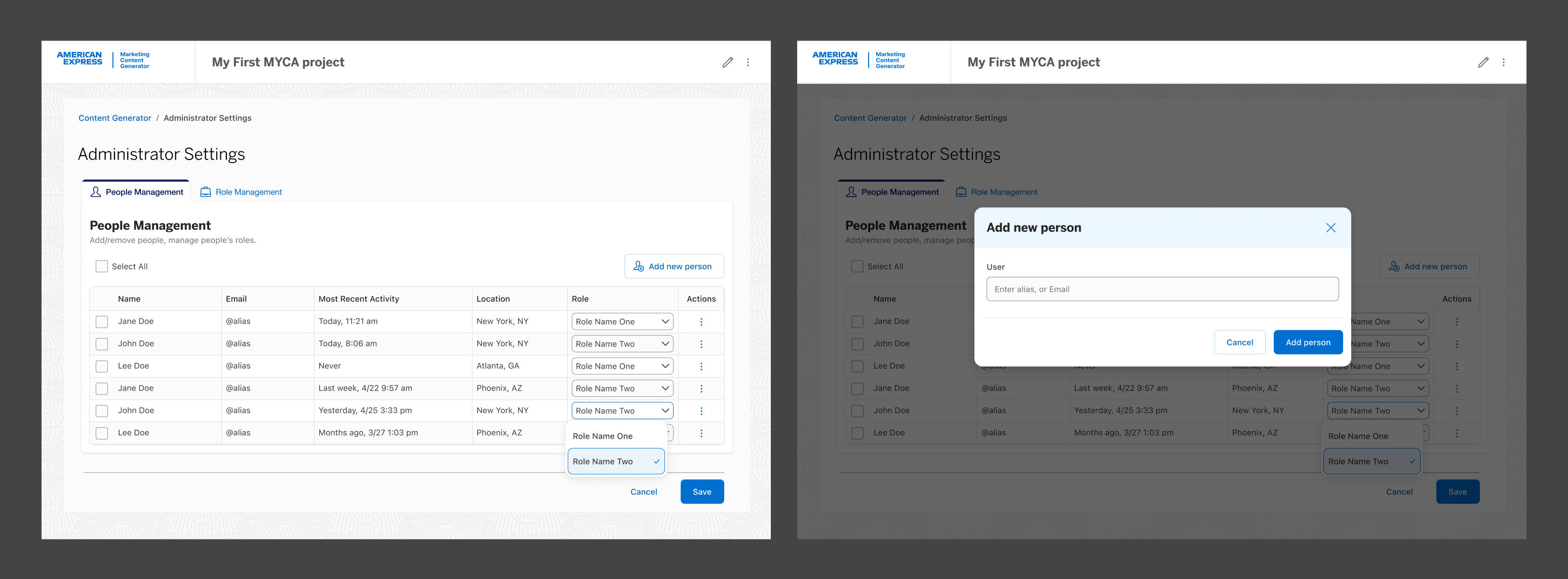
Project Dashboard & Management
I designed an intuitive user dashboard to streamline how users interact with their historical projects. The goal was to make it easy to locate past work, manage bookmarks or favorites, and support key project management tasks such as sharing and collaboration.
Post Launch Impact
The MCG project aimed to simplify fragmented marketing workflows by leveraging generative AI for automated content creation. Post-launch results showed that the redesigned experience not only improved usability but also delivered measurable impact.
Workflow Simplification
Reduction in campaign setup time through a modular setup flow replacing the cluttered one-page design.
Task Success Rate
Success rate on key tasks in usability testing — nearly double prior performance.
User Sentiment
Users described the experience as "streamlined," "intuitive," and "much more manageable."
Return to Home