AUSTIN Health and Safety
By reframing safety data into a prioritized, visual workflow, AUSTIN cut incident‑response time by 27 %, boosted compliance check completion by 18 pp, and saved Amazon ~$1.2 M/yr in injury‑related costs.
The Problem
AUSTIN lacked a unified design system and a clear way for users to manage safety compliance. Associates and managers had to jump between 5+ dashboards, wasting 10+ minutes daily just to track critical tasks—leading to delays and increased risk.
My Role
I guided designers and engineers in adopting and customizing Alchemy Design System components for their domains, ensuring consistent, scalable implementation. In parallel, I collaborated with UX researchers and safety managers to uncover root causes of delays and designed a contextual dashboard to surface critical safety data. I shared prototypes and insights with stakeholders to influence roadmap priorities and align the product with real-world needs.
Research & Discovery
We interviewed users across sites and roles to understand their workflows. A major pain point emerged: users were overwhelmed by the number of tools they had to check daily just to stay on top of safety and compliance requirements.
They needed in-app, role-specific views and prioritized task indicators to focus their time on the most important issues.
“AUSTIN is missing a good overview… I’d rather clean up roadkill than search for a task.”
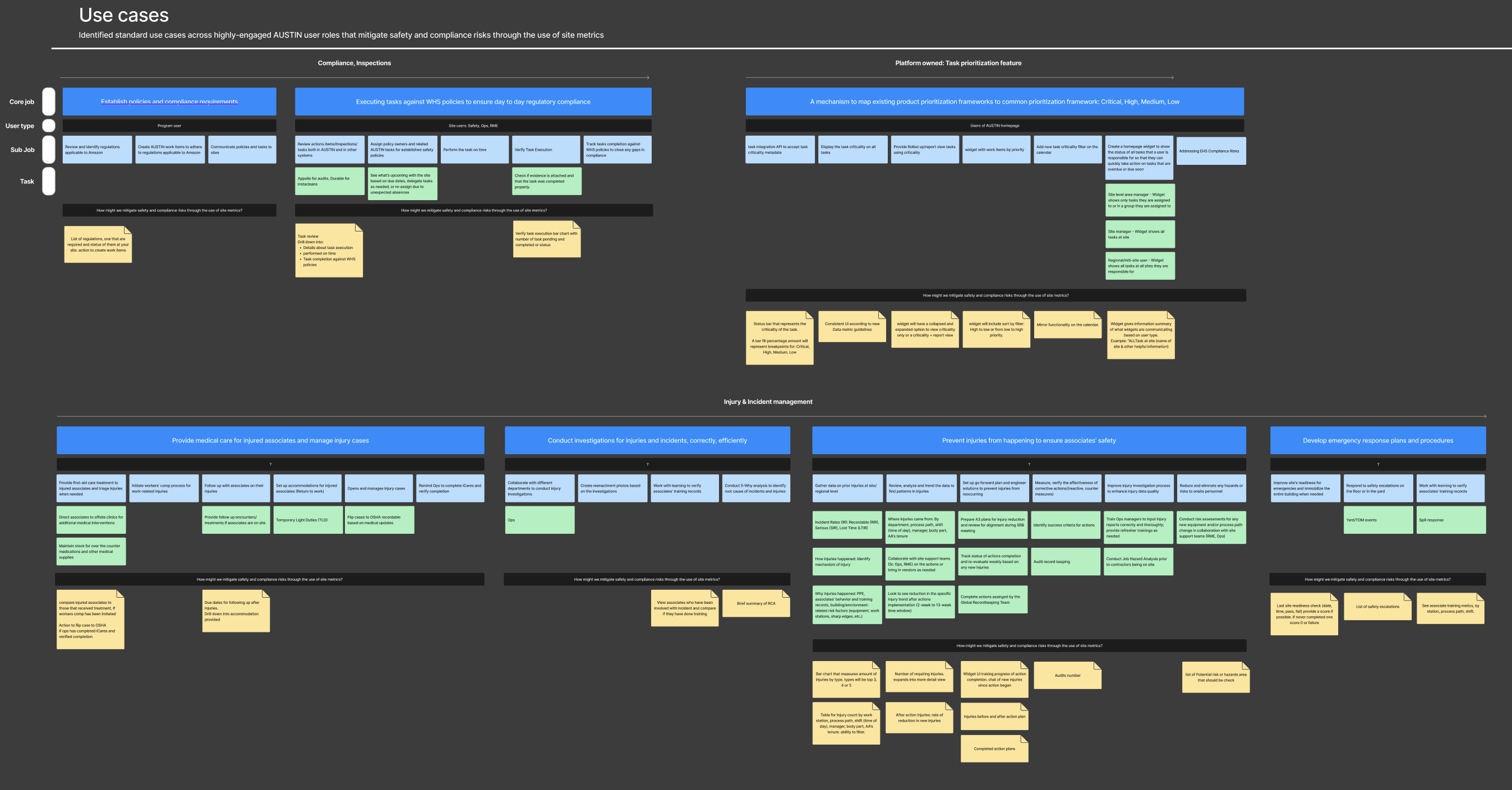
The Challenge
30% of AUSTIN tasks were completed overdue.
Users had to manually switch between 5+ dashboards to assess safety issues.
No central place for tracking prioritized work across multiple sites.
My Approach
I dove into data visualization best practices, working to make complex datasets clear and actionable. I presented multiple dashboard lofi wireframes and widget designs that focused on task urgency, site relevance, and simplicity.
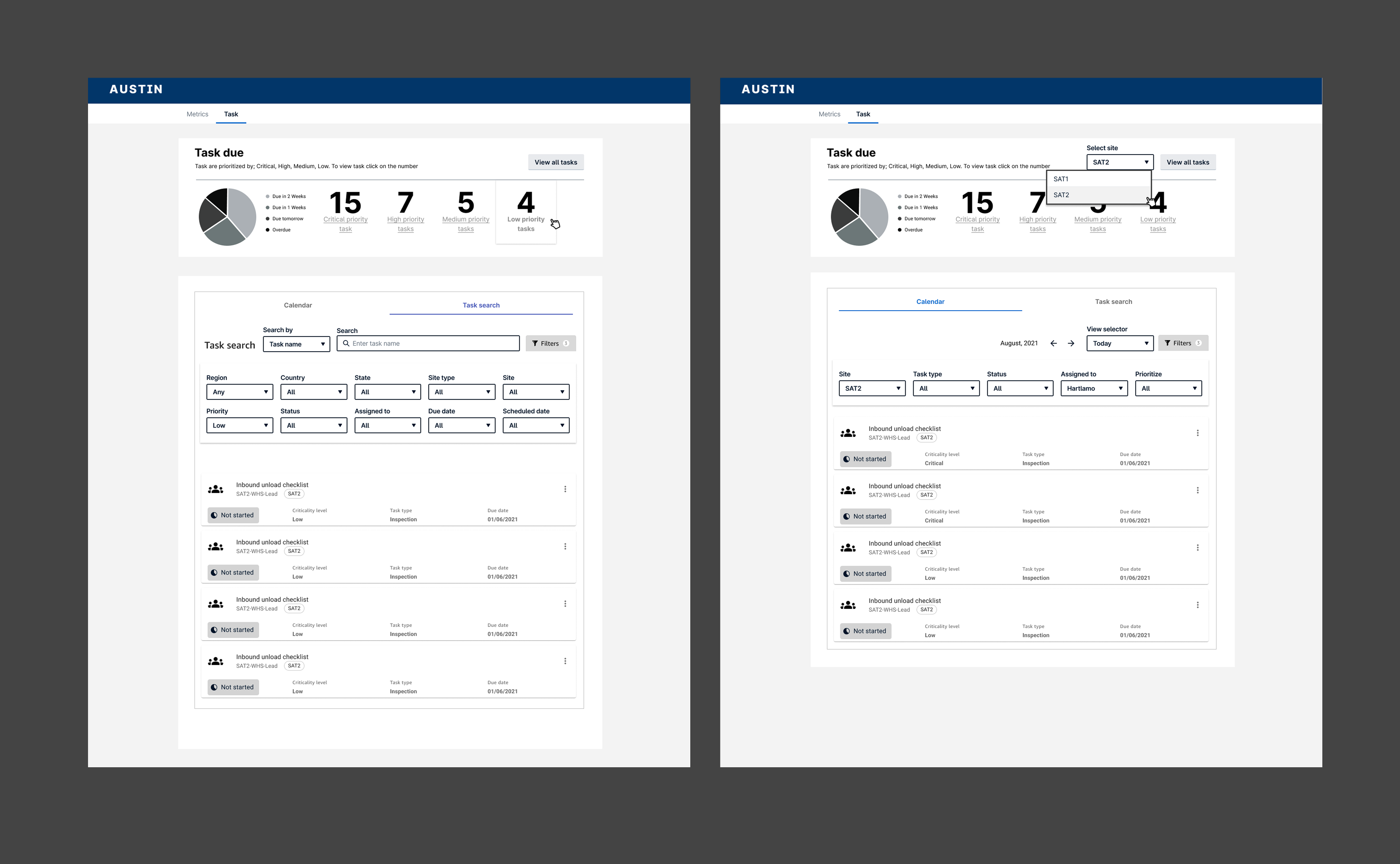
Task Prioritization Widget:
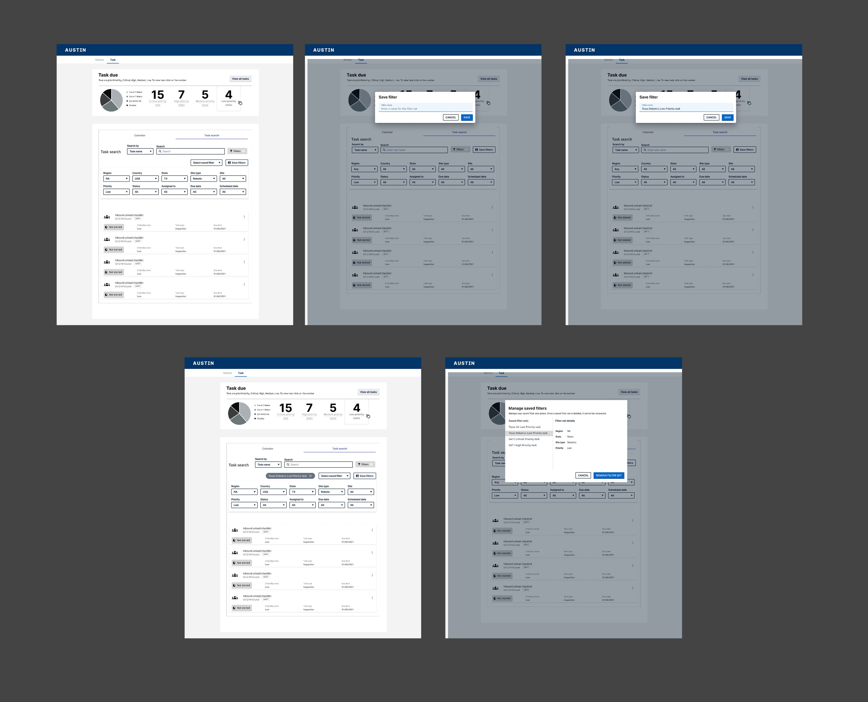
Save Filter Flow:
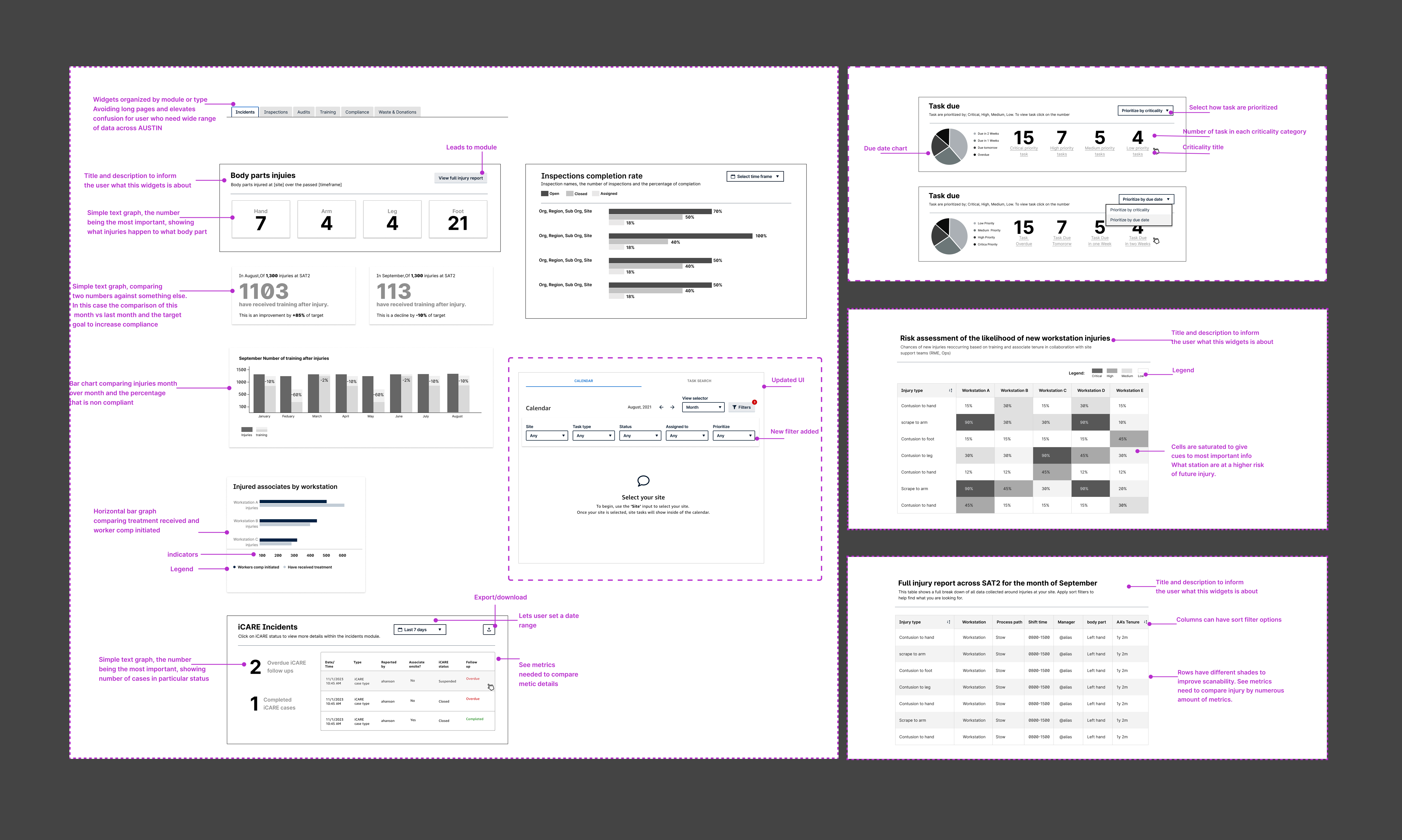
Dashboard Guidelines:
Outcome
Presented lo-fi mockups and stakeholder reports with actionable UX insights. Engineering will begin implementation in late 2024. Early feedback from users has been overwhelmingly positive, particularly on the concept of system-generated task prioritization and reminders.
What I Learned
Designing for safety is more than just showing data—it’s about surfacing the right story for the right person. Each user had different priorities, and that meant designing flexible, role-aware views. This project deepened my understanding of storytelling through data, designing at scale, and advocating for UX within complex enterprise systems.